Loading cart contents...
How to design covers for book series?
More and more authors write their novels in the series. This approach allows them to gain regular readers, increase visibility, facilitate marketing and promotional activities. That is why it is so important to have a smart cover design for that kind of books. The reader should be able to recognize books which come from the same series at first glance. Today we‘ll look at how this effect is achieved by some of the best-selling book series in recent years.
Twilight by Stephanie Meyer

Common:
- colors – black background, white fonts, image with red accents;
- fonts – including a very distinctive, iconic font for the title;
- layout – author’s name on the bottom, title at the top, image in the middle;
- aesthetics – minimalistic, subtle, elegant.
Distinguishing:
- image – different photos, suitable for the novel’s story;
- title placement – subtle variations, to make it work better with the cover’s image.
A Song of Ice and Fire by George R. R. Martin
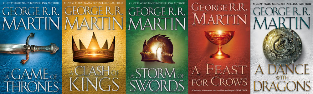
Common:
- fonts – the same for the author’s name and the title;
- layout – author’s name on the bottom, title at the top, object in the middle;
- aesthetics – minimalistic, presenting only one object as a cover’s graphic element.
Distinguishing:
- image – different objects, relevant to the novel’s story;
- colors – unique, prominent color for the background, small variation in the colors of the fonts.
Silo by Hugh Howey
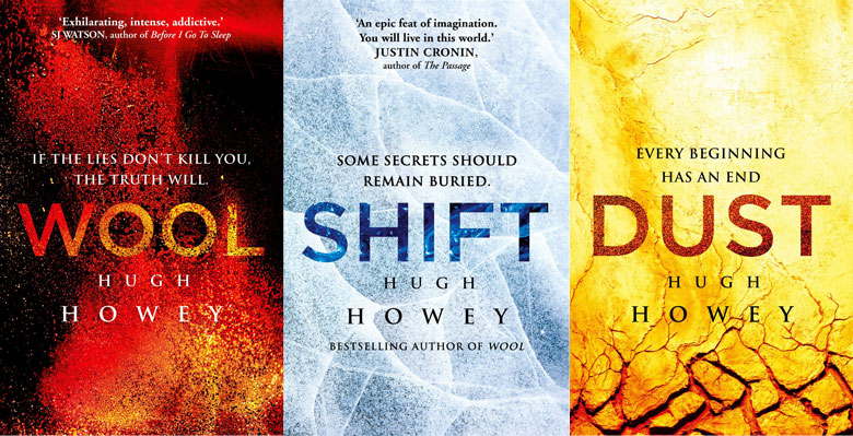
Common:
- fonts;
- layout – big title in the middle, author’s name below;
- aesthetics – minimalistic; subtle graphic elements hidden in the background and the title filling.
Distinguishing:
- color – unique and dominant;
- background’s graphic.
Millennium by Stieg Larsson
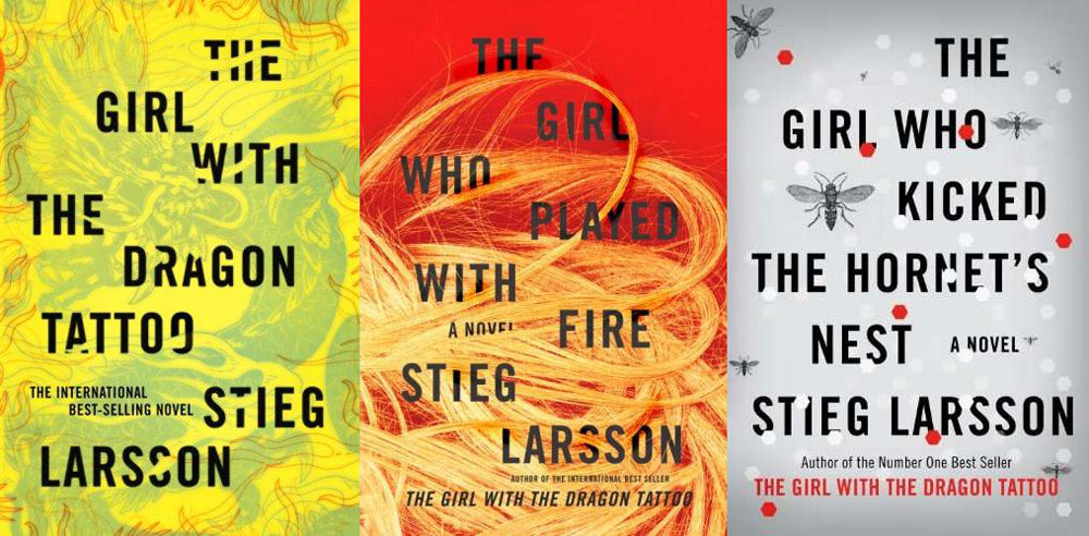
Common:
- fonts – the same for the author’s name and the title;
- layout – the author’s name and the title scattered across the entire surface of the cover;
- aesthetics – minimalistic; simple lettering on colorful backgrounds.
Distinguishing:
- colors – unique, prominent color for each book cover;
- graphic elements – connected to the novel’s story.
Mercy Thompson by Patricia Briggs
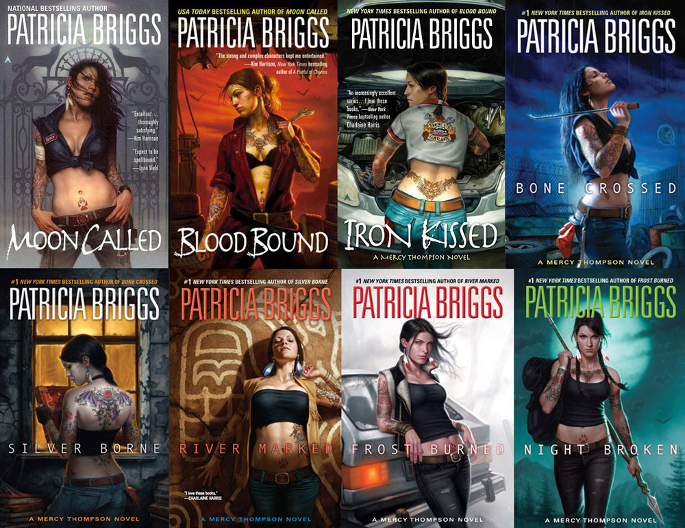
Common:
- fonts – however, the first three books have different title’s font from the rest of the series;
- layout – title on the bottom, author’s name at the top, illustration in the middle;
- subject – Mercy Thompson, main heroine;
- aesthetics – illustrations created by the same artist in the same style.
Distinguishing:
- illustration – different poses and activities of the main character;
- colors – small variation in the colors of the fonts, every image has its own color palette.
The Infernal Devices by Cassandra Clare
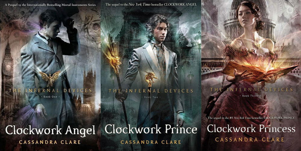
Common:
- fonts;
- layout – author’s name and title at the bottom, name of the series in the middle, person on the background with the buildings as the main graphic element;
- aesthetics – elegant; subdued colors, similar style of characters’ clothing, golden highlights.
Distinguishing:
- image – different people and buildings in the background, relevant to the novel’s story;
- colors – every image has its own color palette.
The Hunger Games by Suzanne Collins
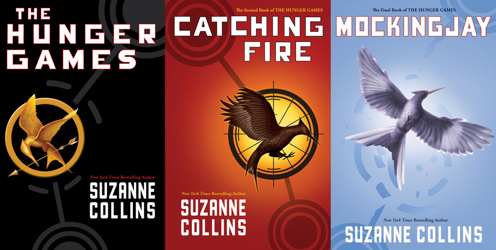
Common:
- fonts;
- layout – author’s name on the bottom, title at the top, object in the middle;
- object – mockingjay;
- aesthetics – minimalistic, presenting only one object as a cover’s graphic element.
Distinguishing:
- image – different objects, relevant to the novel’s story;
- colors – unique, prominent color for the background, small variation in the colors of the outline of the title;
- lettering placement – subtle variations, to make it better correspond with the cover’s image.
Fifty Shades by E L James
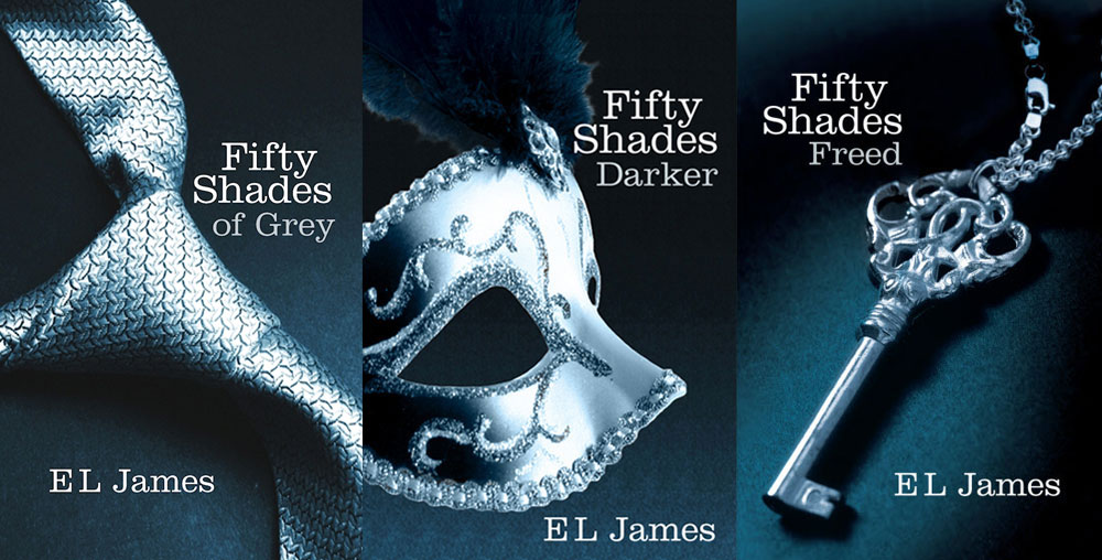
Common:
- fonts;
- layout – author’s name on the bottom, title at the top, object in the middle;
- color – navy-blue, silver, white;
- aesthetics – sublime, elegant and minimalistic, only one object as the cover’s graphic element;
Distinguishing:
- image – different objects, relevant to the novel’s story;
- lettering placement – there are subtle variations, to make it better correspond with the cover’s image.
Summary
Finally, a few conclusions. All the analyzed series use two main tools to maintain consistency between the books in the series – fonts and layout. Keeping these two factors common allows to give an individual character to each novel, without sacrificing brand recognition. Each book can have their unique graphic, adequate for the content. However, it is wise to keep the graphics in similar aesthetics (by style, form or color) to further enhance the recognition of the book series.