Smashwords Bestsellers : What do the self-published books’ covers have in common?
In the last post I was analyzing the covers of the fifteen best-selling books from Barnes & Noble to distinguish some trends or common characteristics among them. Today I will try to see if similar trends rule on the covers of the self-published books. To get a representative sample, I took a look at 15 book covers on the Smashwords Self-Published Bestsellers List, June 2016.
Broken Silence

Book cover design traits:
- alignment: centered
- style: minimalistic, subtle; young woman on a blurred background
- typography: one type of font, two colors; letters are both uppercase and lowercase
- colors: muted; green, black, blue, yellow
Hold You Against Me

Book cover design traits:
- alignment: centered
- style: quite minimal, disjointed composition; elegant man at the top of the cover, blurred background at the bottom
- typography: three types of fonts – serif, sans-serif and handwritten
- colors: blue, grey
The Miracle Morning

Book cover design traits:
- alignment: centered
- style: quite minimal, man silhouette on the sea background, prominent typography
- typography: one type of font – sans-serif, two colors
- colors: blue, yellow, orange, black
Beautiful Burn

Book cover design traits:
- alignment: centered
- style: quite busy, peacock feather in flames on the forest background
- typography: two types of font – serif and script, two colors
- colors: red, orange, green, blue
Rootbound
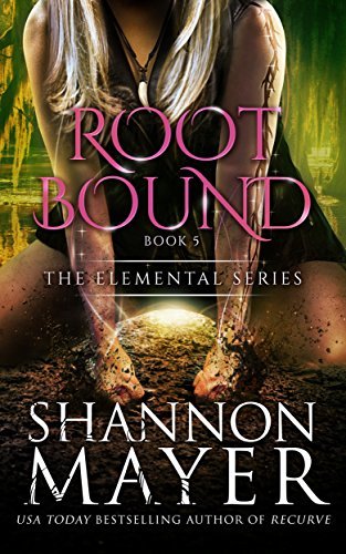
Book cover design traits:
- alignment: centered
- style: quite busy, photomanipulation, woman figure on a fantasy background
- typography: two types of font, both serif, more decorative font for the title, two colors
- colors: pink, yellow, white, orange
Empire

Book cover design traits:
- alignment: centered
- style: quite minimalistic, man figure on a simple black background
- typography: two types of fonts, serif and sans-serif, one white color
- colors: black, white, red, orange
Hunted

Book cover design traits:
- alignment: centered
- style: photomanipulation, couple on a fantasy background
- typography: four types of fonts, both serif an sans-serif; unique font for the title, two colors
- colors: orange, green, white, orange
Fated

Book cover design traits:
- alignment: centered
- style: monochromatic, chaotic; naked bodies in the background, symbols on the foreground
- typography: three types of fonts, serif, one color
- colors: black, white
Undone

Book cover design traits:
- alignment: centered
- style: photomanipulation, movie-poster like; men silhouette on the forest background
- typography: one type of font, serif, golden effect
- colors: gold, yellow, brown
Zenith

Book cover design traits:
- alignment: centered
- style: minimal, symbols on an abstract background
- typography: one type of font, serif, silver effect
- colors: purple, blue, silver
Den of Sorrows
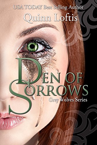
Book cover design traits:
- alignment: centered
- style: disjointed; symbols and female face on a black background
- typography: one type of font, serif, two colors
- colors: green, black, orange
Stripped Bare

Book cover design traits:
- alignment: centered
- style: minimal; men silhouette on a black background
- typography: one type of font, serif, two colors
- colors: black, yellow, blue
Forever

Book cover design traits:
- alignment: mixed
- style: busy, photomanipulation; symbols and female face on a gradient background
- typography: two types of font, more decorative for the title, serif, one color
- colors: pink, blue, yellow, white
Mercy Watts Box Set

Book cover design traits:
- alignment: centered
- style: cartoonish; bubbles and female face on a blue background
- typography: one type of font, handwritten, three colors
- colors: white, yellow, blue
Baked to Death

Book cover design traits:
- alignment: mixed
- style: busy, photomanipulation; cookies on flames on a kitchen background
- typography: five types of fonts, serif and sans-serif, three colors
- colors: red, yellow, white, blue
Conclusions
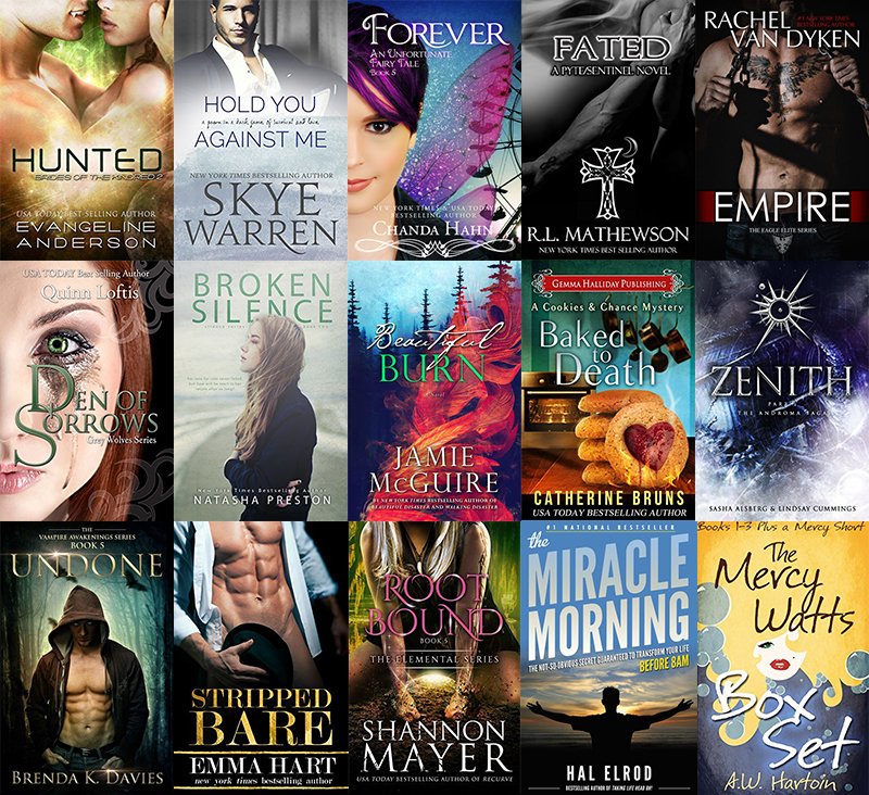
It is interesting that the analyzed covers, unlike the covers studied in the last post, were not representatives of a wide variety of genres. Smashwords Self-Published Bestsellers were mostly romance books, with a few exceptions for a self-help book, fantasy and young adult books. This could be one of the explanations for the fact that the most of the covers feature human face or silhouette. Few other dominant trends in book cover design can be noticed:
- central alignment
- photomanipulations
- busy fonts
- rich color palette – mostly two or three main colors for the cover
- typography not a main priority – often generic fonts
- faces and human silhouettes as the main objects
As you can see, dominant trends are quite different for the self-published and in-house published books. The question is – which trends should self-publishers take into account when trying to design eye-catching, professional looking book cover?
