Loading cart contents...
New Twilight Book? Cover Reveal for George R. R. Martin’ Winds of Winter?
… unfortunately only a click bait title ;). This is just a quick post about a little project I did for fun.
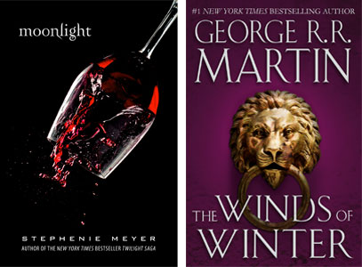
While preparing the post about covers for book series I was wondering if I can replicate the look to fake a new book cover in the series. I managed to create two: “Moonlight” cover for the Twilight Saga, and “Winds of Winter” cover for A Song of Ice and Fire.
Moonlight – Twilight by Stephanie Meyer
This was my analysis of the Twilight’s covers:

Common:
- colors – black background, white fonts, image with red accents;
- fonts – including a very distinctive, iconic font for the title;
- layout – author’s name on the bottom, title at the top, image in the middle;
- aesthetics – minimalistic, subtle, elegant.
Distinguishing:
- image – different photos, suitable for the novel’s story;
- title placement – subtle variations, to make it work better with the cover’s image.
Using this knowledge, I managed to create this cover:
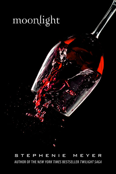
My main goal was to keep the minimalistic, subtle and elegant character of the Twilight covers.
The whole design follows the original covers layout. As you can see, I used a black background, white fonts and image with red accents. I used a Zephyr font for the title, BankGothic for the author’s name and Myriad Pro for the subtitle, and for the picture I chose this photo of the spilling wine.
Winds of Winter – A Song of Ice and Fire by George R. R. Martin
This was my analysis of the A Song of Ice and Fire‘s covers:
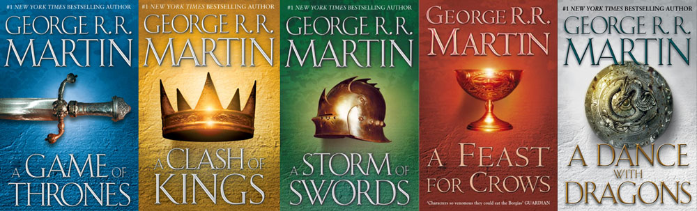
Common:
- fonts – the same for the author’s name and the title;
- layout – author’s name on the bottom, title at the top, object in the middle;
- aesthetics – minimalistic, presenting only one object as a cover’s graphic element.
Distinguishing:
- image – different objects, relevant to the novel’s story;
- colors – unique, prominent color for the background, small variation in the colors of the fonts.
Using this knowledge, I managed to create this cover:

I had some problems with the implementation of this cover. Firstly, I do not know exactly what font was used. Thanks to this site, I found a few free fonts that were sufficiently similar. I decided to use the font OptiBauer for the title and author’s name, and Garamond for the top line of text. I added subtle text effects and light shade.
I also struggled with choosing the appropriate graphics – I did not want to repeat a theme already present (eg. weapon or helmet), but I wanted to use a metal object like the original books covers had. In the end, I chose the door knocker in the shape of a lion’s head, referring to the theme of the gate and the novels’s important Lannister family. I photoshopped the image, aging the knocker and giving a lion a more menacing look. The last thing was to put everything on a background in royal purple color.
And that would be that!